Graphic design is a form of visual communication. It uses a combination of photography, typography and illustrations put together by graphic designers to create visual representations for clients who can be companies or individuals such as artists and bloggers. Every client is different in terms of branding, purpose, and preference. They know what they want and it is the graphic designer’s role to put everything into consideration to come up with materials. Unlike a few years ago wherein they rely mostly on boring stock photos, the more widespread use of social media has leveled up the expectations and demand on graphic design.
The year is already coming to a close. It is important get ahead of competition so it is important to look ahead into the graphic design trends in 2021:
Multiple Color Schemes – Companies used to only stick to one color scheme that matches that on their logos. Current trends call for variety to help companies update their brand and reach. This re-branding technique requires a good selection of color schemes. New official brand colors are added instead of changing their logo designs.
Geometric Shapes – Abstract shapes that are flowing through graphic designs have been a big thing in the past recent years. This year, however, the use of geometric shapes is the trend and is expected to continue to be so in the next few years. Whether they overlap each other or float on the design space, you see them everywhere. It may sound basic if you think of shapes on the top of your head right now, but, when used creatively, they actually create consistency and order on the design itself.
Muted Color Palettes – The use of risky, bold and bright colors is so 2018. With the rising trend on minimalism in lifestyle, audiences better appreciate subtle and soft colors that are pleasing to the eyes. Whether you use darker or lighter fonts, muted colors will help your text stand out. The subtlety that muted color palettes and geometric shapes are eye-catching.
Old Simple Fonts – This makes a lot of sense when used with geometric shapes and muted color palettes. Classic fonts put the elegance on every design. This does not only work on graphic designs used on websites, but also on social media. Posts with simple fonts projects a level of authenticity and trustworthiness which is highly positive for any brand.
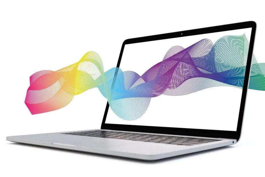
Color Gradients – Whether for social media graphics, website headers or background, color gradients have not faded away in graphic design. Companies prefer to use gradients because they elevate the design and add depth to illustrations. With muted colors incorporated into the gradient, the designs turn out to be modern and professional.
Thinking Baboon is a web designing company that provides Graphic Design service. We take the message that you want to communicate to your audience to our core when we create designs. We make sure to fully understand your needs, as well as your preference. Our team of experienced graphic design professionals always adapt to the latest trend to make your brand stand out and up-to-date.
Send us an email now so we can get started!